Are you searching for a blue-green shade to paint your kitchen cabinets? Does a calming, well-balanced blue-green appeal to you? Today, we’re exploring Benjamin Moore Wythe Blue to learn about its undertones, how it looks in different lighting situations, and ideal colors to pair with it!
I spend a lot of time talking about neutral paint shades. You know, those beautiful whites and off-whites, grays and greiges, too, that most people want to use in their kitchens. Think Alabaster, Accessible Beige, Mindful Gray– Those extremely versatile colors play well with others and go with anything and everything.
And that’s all true, and good and well…but.
But!
Once in a while, I work with a client who wants to break out of the neutral mold just enough to enjoy some color. Although I love neutral shades, I enjoy getting to work with other colors here and there, too.
Color is the spice of life, after all, right?
Blues may not always be as neutral as grays and greiges, but they can be neutral enough. What’s more, like the ocean, blue shades are calming, grounding, and timelessly beautiful.
Today, I’m doing a color study on Benjamin Moore Wythe Blue. This rich blue-green is part of Benjamin Moore’s Historical Color Collection and was even chosen as Benjamin Moore’s 2012 Color of the Year.
It’s still incredibly popular today!
This hue is ideal for coastal, traditional, contemporary, and farmhouse-style homes. Before you grab a paintbrush, though, hang on. There’s a lot to love – and a few things to know – about BM Wythe Blue, so let’s dive in!
What Is The LRV Of Wythe Blue?
LRV (Light Reflective Value) is a number between 0 and 100 that indicates how light or dark a paint color is. Zero means the shade is pure black, while one hundred means the shade is pure white.
Learning the LRV of different colors you like is necessary because it gives you a way to evaluate a color’s level of brightness that isn’t dependent on your subjective evaluation of it.
Wythe Blue’s LRV is 48.69, which puts it in the medium range – not too light or too dark. Despite being mid-toned, it still offers rich saturation that doesn’t fade away as soon as light hits it.
Wythe Blue Undertones
Every color has undertones, which can be subtle or obvious. There can be one primary undertone or multiple.
I strongly recommend learning about the undertones of colors because knowing how your chosen colors are likely to “behave” will help you choose the right colors for your home and decor.
Pro tip: Use Samplize to check all your favorite colors in your home to see how they behave before you buy gallons of them!
For Wythe Blue, the base is a mix of blue and green.
Is it blue with green or green mixed with blue? It actually sits right in the middle and will lean different ways depending on the light. Plus, there’s some gray thrown in there to tone everything down.
The resulting shade is a calm and serene shade of blue-green that sometimes looks citrusy and, at other times, looks more muted. In certain lighting situations, you’ll see the gray peek through more than in different situations (see more about that below).
Mostly, though, you’ll notice that it’ll read more blue at times and more green at other times.
Overall, Wythe Blue is a cool-leaning blue-green – although it won’t feel cold on your cabinets. It’ll just lend a relaxing vibe to the room.
Benjamin Moore Wythe Blue vs. Palladian Blue
These two colors are both gorgeous mixes of blue-green. The difference is that Wythe Blue (LRV 48) is darker than Palladian BLue (LRV 61). They’ll read similarly in rooms, but I recommend using Wythe Blue in brighter rooms, so the color doesn’t wash out.
Since Palladian Blue is slightly lighter, it’ll tend to be more versatile.
Benjamin Moore Wythe Blue vs. Stratton Blue
Stratton Blue is a dark blue-gray (LRV 37) with deep green undertones. It reads deeper and more muted than Wythe Blue.
Benjamin Moore Wythe Blue vs. Catalina Blue
These two colors are very similar! In fact, they have nearly identical LRVs. The significant difference between them is that Wythe Blue leans towards blue while Catalina Blue tends to read more green.
How Lighting Impacts The Appearance of Wythe Blue
Paint colors are not stationary things. Instead, they act almost like living, breathing objects that shift and change based on the light around them. Different types of light draw out various subtleties in paint shades.
Here’s how Wythe Blue will appear in lighting situations.
South-Facing Light
In south-facing rooms, the warm-toned light will draw out the blue-green in Wythe Blue while the gray undertones take a backseat. It will appear brighter, less muted.
North-Facing Light
In a room with little natural light or cool northern light, the gray undertones will pull through more strongly. Expect Wythe Blue to appear as a muted blue-green.
Pair These Shades With SW Wythe Blue
Although you may not immediately think of Wythe Blue as a neutral shade, it has enough gray in it that it can pair well with many different colors. And, since it falls right in the middle on the LRV scale, it can look stunning with both lighter and darker shades.
Try pairing it with:
- Olivetint (Benjamin Moore)
- Shaker Gray (Benjamin Moore)
- Van Buren Brown (Benjamin Moore)
- Distant Gray (Benjamin Moore)
- Palladian Blue (Benjamin Moore)
- Edgecomb Gray (Benjamin Moore)
- Dover White (Sherwin Williams)
- Revere Pewter (Benjamin Moore)
- Guilford Green (Benjamin Moore)
- Harbor Gray (Benjamin Moore)
- Tuscan Coral (Benjamin Moore)
- Simply White (Benjamin Moore)
- Huntington Beige (Benjamin Moore)
Examples Of Kitchen Cabinets Painted In BM Wythe Blue
Wythe Blue is a terrific alternative to neutral paint on cabinets, and it happens to shine in that role. Consider using it when you want to add a little more color and character (don’t forget those calming vibes!) than neutrals will provide in your kitchen.
Check out these examples of Wythe Blue cabinets:
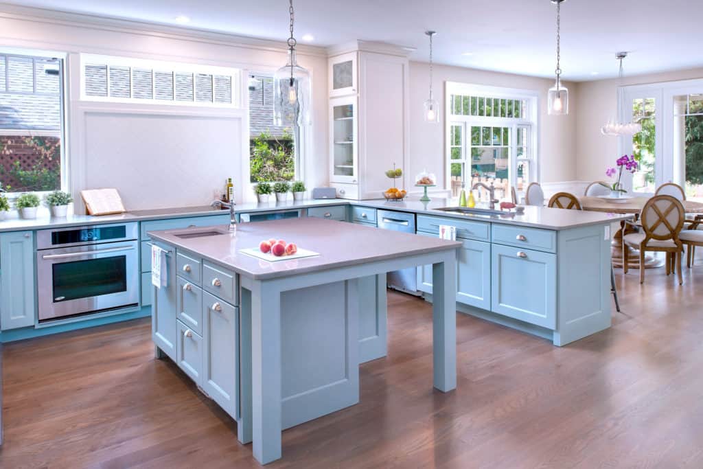
Bright Natural Light
This large, airy kitchen from RD Henry & Co gleams with Wythe Blue lower cabinets and a kitchen island. The bright natural light and wood tones make the color read soft light blue.
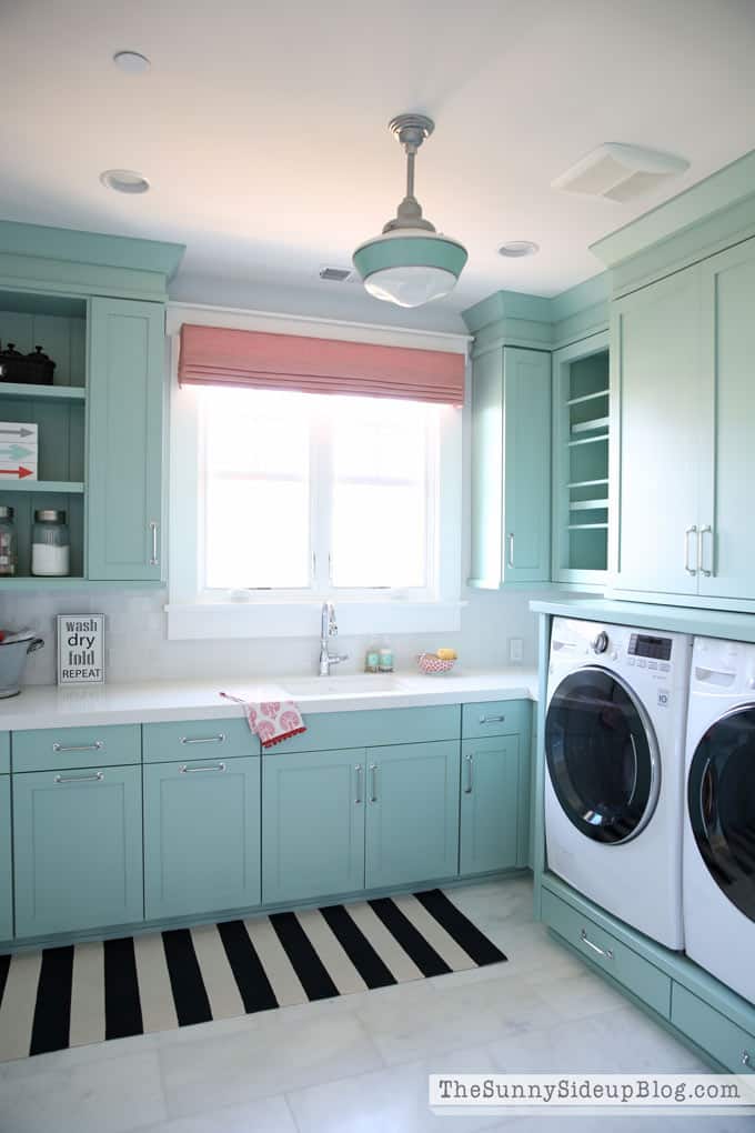
Tranquil And Beautiful
Wythe Blue isn’t too dark to look stunning on cabinets in a room that has a medium amount of natural light. The low level of light pulls out the green undertones.
These cabinets from Sunny Side Up help create a tranquil room you really want to spend time in.
Wythe Blue Island
This pretty island from The Leslie Style shows just how well this shade can work in a fairly neutral, farmhouse-style kitchen. It adds just the right amount of pop to the space!
Although Wythe Blue may not be one of my top neutral cabinet paint colors, it’s still a lovely color that I wholeheartedly recommend. Make sure you check out swatches of this color in your home to ensure no undesirable undertones appear.
Will You Choose Benjamin Moore Wythe Blue Right For Your Cabinets?
Do you feel anxious at the thought of painting your kitchen cabinets? If so, you aren’t alone! I firmly believe that anyone can paint their kitchen cabinets. That’s why I created my DIY Cabinet Painting 101 class to show you everything you need to know to do the job the right way the first time.

Leave a Reply